Should sustainability be the main call out on your packaging?
2-min read
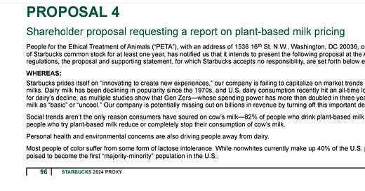
Before we get into it — last week I posted about Dunkin’s lawsuit over charging more for alt dairy. A reader shared that Starbucks has a similar thing going on with this shareholder proposal:
Now back to today’s topic:
One of the challenges with launching a packaged food brand today is that nearly every category is so crowded that it’s hard to stand out. Lately many founders can’t seem to get past the design process to work on other parts of their business, so this week and next week I’m focusing on packaging.
Not long ago you could make a better-for-you version of anything and differentiate on functional benefits alone. But today, better-for-you isn’t enough.
Today, unless you have a super innovative offering, you need killer branding and marketing that moves past functional benefits and taps higher-order, emotional benefits.
When I interviewed Neutral Milk on The Future of Agriculture podcast, they certainly felt that their mission – carbon neutral milk – was a differentiator integral to their brand message. When they launched, sustainability was at the top of their message hierarchy. “This milk fights climate change” is the first thing you read on pack.
In a category where it’s hard to differentiate on taste and nutrition – and where sustainability is such a hot topic – the importance of climate messaging is real.
The problem is cow’s milk and milk alternatives mingle freely in the refrigerated case and there was nothing in the original design that indicated this is cow’s milk. Most sustainable brands in the dairy case are animal-free.
Now check out the redesign:
This redesign gets a lot of things right – besides pictures of cows – that tell us it’s real milk.
I really like the way they moved the brand name up, which now connects the mission of fighting climate change with the tag line, “Carbon neutral from grass to glass”. This explains how they are achieving their mission throughout the whole supply chain. By adding in this copy, it gives meaning to the brand name Neutral.
I also like how they retained the yellow main color but with a fresh overlay of curvy, milky white. Much more appealing than the original all-yellow, angular design.
Kudos to the folks at Neutral and design agency Faven Creative for nailing this!
If packaging design is gnawing at you, look for next week’s newsletter where I’ll be covering some simple rules to follow.
All my best,
Jennifer


